Work / Case study
Zwierciadło Urody — a website the salon runs itself
The website of an aesthetic beauty salon in Nowy Targ. 16 treatments, a guide organised by skin concern, and a simple panel: the owner updates prices, the results gallery, the blog and announcements herself — without waiting on anyone.
View the live site: zwierciadlourody.plClient
Zwierciadło Urody
Scope
Website + salon panel + Plansy calendar
Region
Tatra mountains, Poland
Approach
The salon owns the content
Results
4.9 / 5
average client rating
TOP 5
on Google in Nowy Targ — up from the second page
16
treatment pages, with before-and-after results
8
“I have a problem with…” guides that lead to a treatment

Visual direction
Warmth and elegance instead of clinical cool
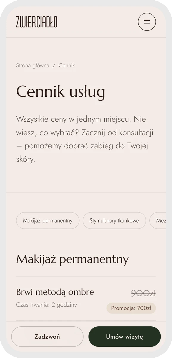
A porcelain background, brass accents and deep forest green. A classic, refined heading typeface paired with light, readable text, and calm section reveals as you scroll. Professionalism that puts you at ease — not one that intimidates.
A client buys trust, not just a treatment
Decisions about facial and skin treatments are emotional — what matters is whether the salon looks professional before anyone even reads the price list. Instead of one overloaded page of offers, we built a structure borrowed from the best beauty brands: clear navigation between treatments, a separate page for every service, and a consistent, warm visual language. The site works like the best consultant: it explains the treatment, resolves doubts, and leads to a booking.
How we built it
01 — An answer to the problem, not just a treatment list
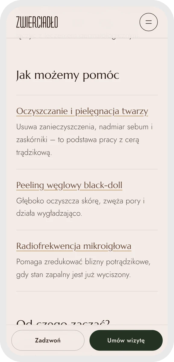
Not every client knows which treatment she’s looking for — but she knows what she wants to deal with. For the 8 most common skin concerns — acne, wrinkles, discolouration, broken capillaries and more — the site explains which treatments actually help and leads straight to them.
02 — Results that speak for themselves
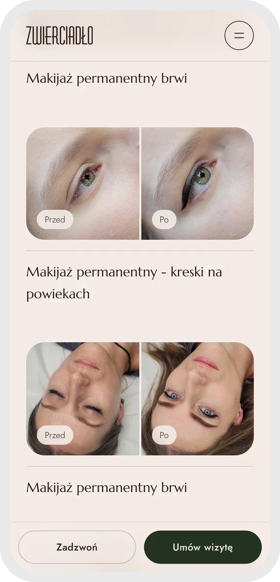
Every treatment page shows before-and-after photos and related blog posts. The salon adds to the gallery itself, straight from a phone — new results go live the same day.
03 — A panel anyone can use
Prices, gallery, announcements at the top of the site (“closed 12–19 August”, “new treatment available”) and days off. The site shows on its own whether the salon is open right now, so nobody turns up to a locked door.
04 — A blog post in minutes
The owner publishes a finished post in a few minutes — no copywriter, no waiting on anyone. She picks a topic, checks the text, adds a photo and it’s live.
05 — Booking is always one click away
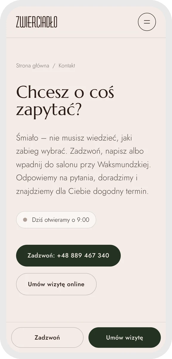
An online booking button sits on every page, with prices, opening hours and directions always at hand. Within six months the salon climbed from the second page to the top five on Google in Nowy Targ.
What the salon gets
We own the design and structure. The salon owns the content.
A salon’s offer changes every season: new treatments, new prices, new results photos. So everything that changes, the salon manages itself in a simple panel — and the site always looks the way we designed it.
Behind the scenes
The website is half of it. The other half is the salon’s calendar.
The same price list and opening hours power Plansy — the system the salon uses for its schedule, clients and visit reminders. A change in one place shows up everywhere at once — on the website, in the calendar and in the salon’s statistics.
See the Plansy project →On a phone
“A good salon website is one the owner never has to think about — and when she wants to change something, she does it herself.”
blackpixel — on building the site for Zwierciadło Urody
Want something like this for your brand?
We design websites without compromise and build systems that make growing your offer easy. Tell us about your project — we'll propose a direction and a scope.